Project Overview
Challenges
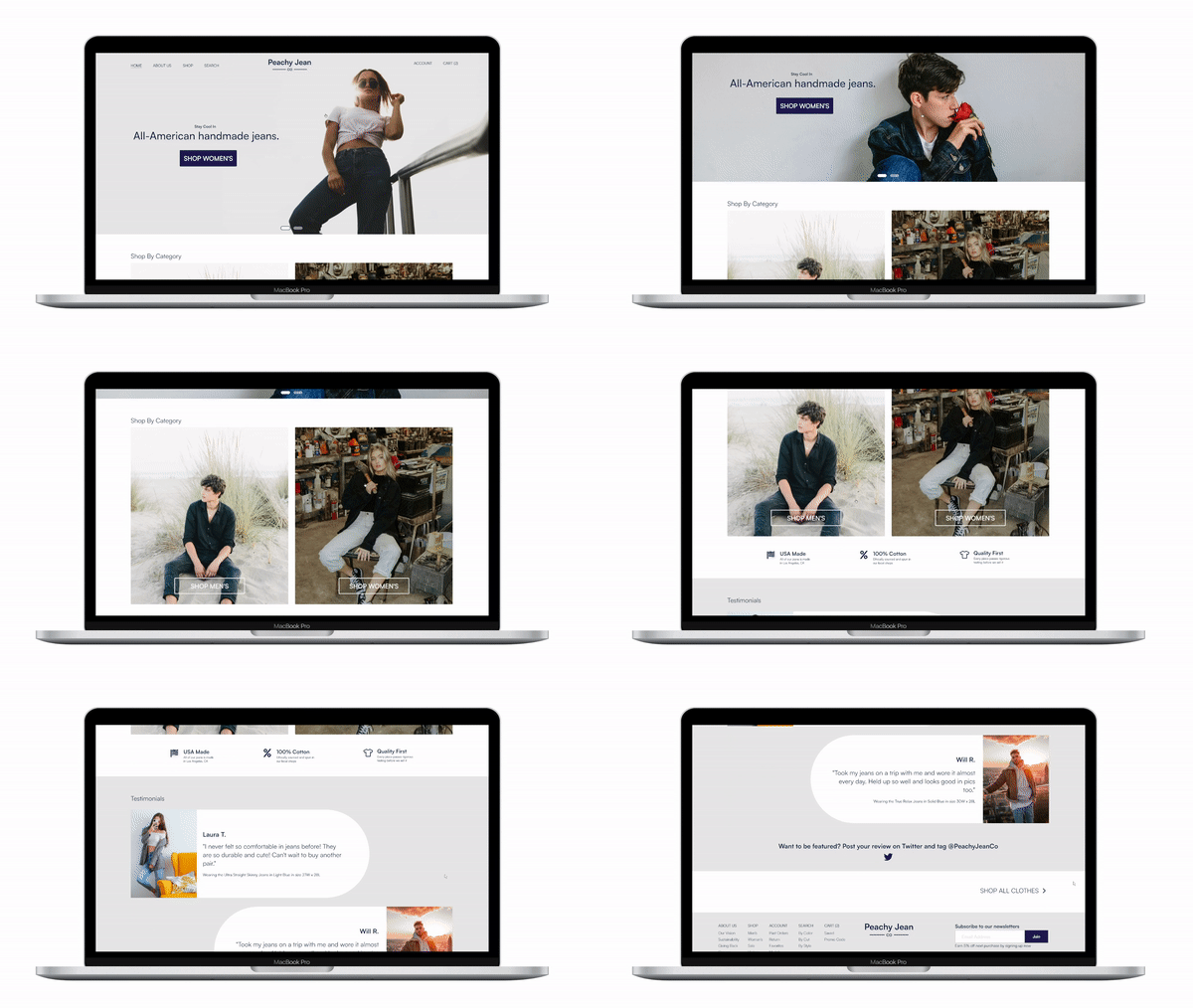
Peachy Jean Co. is a responsive website designed to allow users to seamlessly purchase clothing. For this case study, the user’s main problem were confusing interfaces from similar clothing websites that have form over accessibility.
1) Research and design a responsive website with a one week deadline.
2) Design a simple and streamlined user experience to minimize user pain points
3) Simplifying the purchasing experience while maintaining accessibility
User Research
Pain Points
In this project, I focused on the user’s biggest pain points, which proved to be very effective in keeping the user’s experience as the focal point. I used social media as a tool to survey what people seek in a user friendly responsive clothing website.
78% of people that were surveyed almost exclusively purchase their clothes online, and 66% said that they purchased clothes online within the past month.
After conducting initial user research, I defined 4 major user pain points before beginning the design process.
1) No Clothing Quality Transparency
Users feel frustrated with purchasing clothes only to get poor quality items. They would like to see more transparency of where their clothes came from and its quality.
2) Accessible Web UX
Some websites have small buttons and little call-to-action navigation, creating a difficult user experience.
3) Deceptive Return Policy
Users mentioned the frustration with lack of transparency and difficulty returning clothing items. They would like to see a streamlined return flow.
4) Slow Order Tracking
With a user’s busy life, worrying about where their package is should not be a concern. They would like to see an accessible way to see where their order is at anytime.
Meet The Users
PRIMARY
Name: Emma
Age: 20
Education: Pursuing Degree in Marketing
Family: Single
Occupation: College Student
Emma is a sophomore college student that spends time browsing clothing websites on the go. She wishes that she could buy clothes that did not fall apart after a few washes.
“I dislike fast-fashion clothes, I want something that lasts.”
PRIMARY
Name: Noah
Age: 28
Education: BA in Fashion Design
Family: Married
Occupation: Barista
Noah is a coffee shop barista that wants to feel comfortable returning clothes he doesn’t want. He also wishes websites were more accessible.
“Vintage shopping can be scary, what if the clothes need to be returned?”
Competitive Analysis
Key Competitors
Our key competitors are all online denim retailers, Blue Delta and Detroit Denim which are direct competitors since they are smaller businesses that make handmade jeans. Levi’s is our indirect competitor because they are a large company that does not make jeans by hand but at a large volume.
Opportunity
Clear and strong brand identity
Simple navigation that does not overwhelm the a first time user
Consistent tone throughout website
Transparent denim quality and how clothes are made
Utilize customer testimonials
Exploring the Journey
I constructed a simple user flow of what a start to finish journey looks like when purchasing clothes online. This helps me understand how users will navigate through the website and allow me to see this experience through their perspective.
Site Map
Wireframes and Flow
After creating preliminary paper wireframes for both the website and mobile version of the project, I iterated on how to make the process as simple and effective as possible. Overall, there were 5 iterations before I decided on the flow and layout. This took a lot of time, but I really wanted to craft the best user experience.
Usability Study
Three questions that were asked during the usability study were:
“What frustrated users most about navigating the website?”
“Can the users find the product they are looking for?”
“Do users thing the site is easy or difficult to use?”
Round 1 Findings
Users want to see similar item groups together when browsing
Users do not want to scroll indefinitely to see jeans
Users want a “Save for Later” option in their shopping cart, and would like a sizing chart
Round 2 Findings
Users want a clearer prompt during checkout phase
Users want more iconography
Before Usability Study
After Usability Study
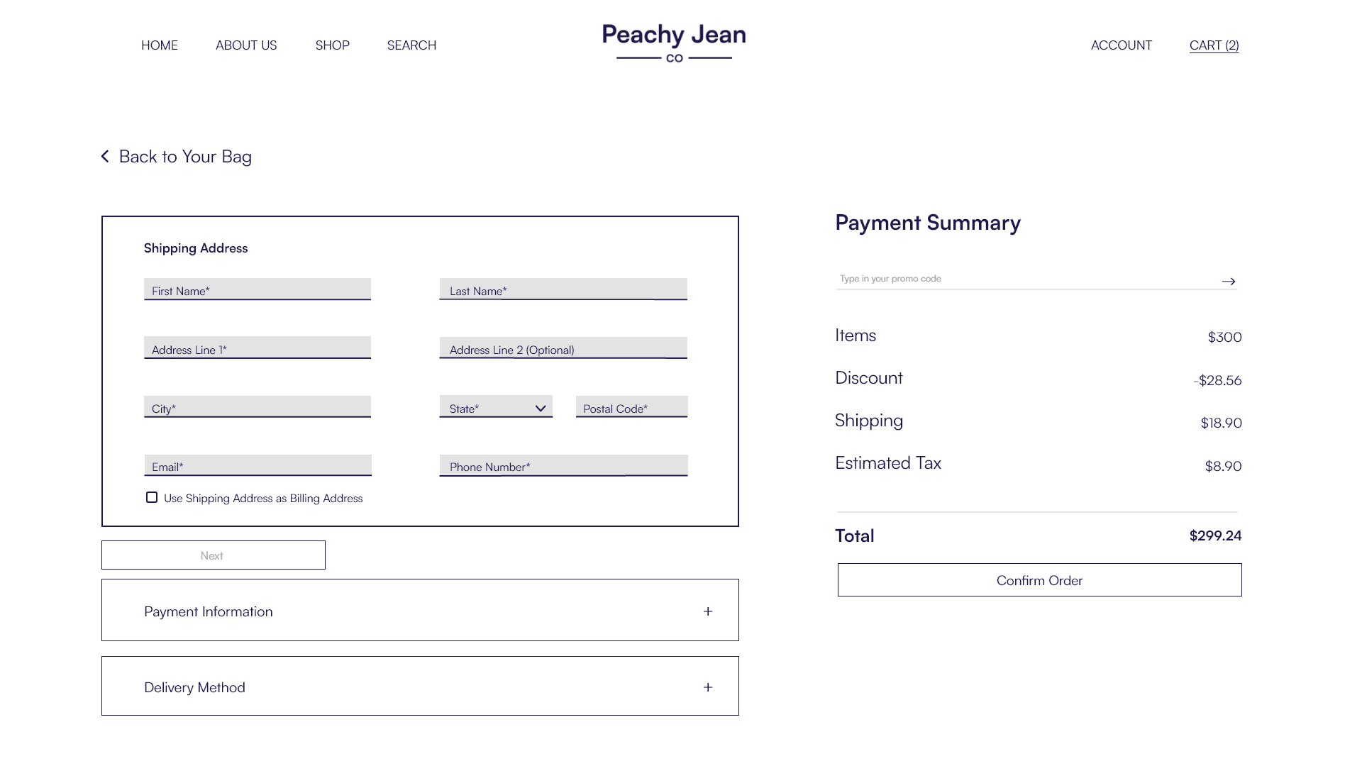
No indication to prompt the user to fill out needed fields to complete purchase, led to users hesitating or even stopping their flow completely.
Needed fields are highlighted with a light gray, still maintaining enough contrast for WCAG guidelines. Additionally thickened the border around the current general field (ie. Shipping Address Box).
Accessibility Considerations
1
2
3
All important information is in at least 18pt font, so the user will not have trouble reading anything on the site.
My chosen colors for this brand is very high contrast for the user, ensuring the best readability.
Every section is clearly described so users will always be aware of where they are, or can easily find out.
Challenge 1
Design on a Deadline
By challenging myself to complete a project of this size within one week, I had to maintain user experience as the number one priority in order to have a successful experience. I believe that even in this strict timeline, I was still able to achieve what I set out to accomplish.
Challenge 2
Accessible Navigation
Users stressed their frustration with unintuitive retail clothing sites that put form over function. By keeping the interface simple and showcasing the product through imagery, the users can craft their own journey without feeling overwhelmed.
Challenge 3
Purchasing made easy
After multiple usability studies, I iterated on the purchasing experience to keep it within one page so the users are less likely to get confused as well as highlighting fields that need to be filled out. By implementing these two things, I believe I have achieved a streamlined process.
Style Guide
While my normal design style involves a lot of colors and iconography, I wanted to challenge myself to design something sleeker and with a more serious tone. This brand is serious about their clothing quality and their commitment to sustainability. Keeping this in mind, I decided to keep it simple and let the products shine through to the user.
Takeaways
Impact
The website makes the users feel like they can easily find and purchase jeans without feeling lost within the site.
What I learned
While designing the Peachy Jean Co. website and app, there were a lot of ideas that would not have been accessible on a different medium. Since I gave myself a strict deadline with this project, it forced myself to focus on what was necessary and what was not important.
Quote from peer feedback:
“This website feels very professional. I feel like I could open this up and buy something without thinking twice about it.”
Check out the process deck below to see the full Peachy Jean Co. creation journey!


